Demonstration report · Bioinformatics · Dermo-cosmetics

What a GenXMap RNA-seq report looks like: a dermo-cosmetic example

A worked example of the report we deliver for a bulk RNA-seq study on ex vivo skin explants, comparing untreated explants with explants exposed to a dermo-cosmetic active. It shows the structure, the figures and the level of documentation. It is not the result of a real study.

Demonstration data. All data on this page are for demonstration only. No real product, client or study is described.

Model: ex vivo skin explant Technique: bulk RNA-seq Data: synthetic, for demonstration Genome: GRCh38.p14 / GENCODE v43 Author: Raheleh Shayan, PhD Updated: October 2026

01Quality control

Before any biological comparison, every library is screened on alignment rate, base quality, GC content and duplication, split by condition, to rule out a technical explanation for any downstream signal.
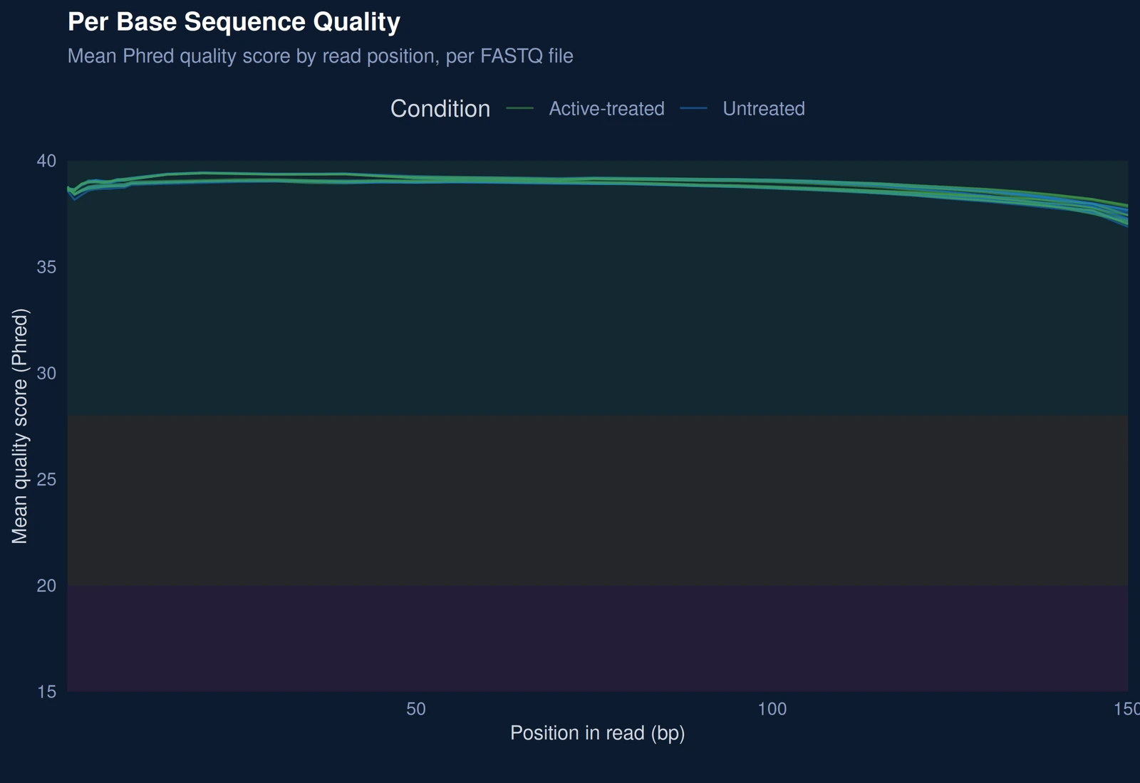
Per-base sequence quality from FastQC, mean Phred score by read position
Figure 1. Per-base sequence quality. Mean Phred quality score at each position along the reads, one line per sequencing file, coloured by condition. The green band marks good quality (above 28), orange acceptable, red poor. All files stay in the green band along the whole read, with no condition lagging behind: base quality cannot explain a later difference between groups.
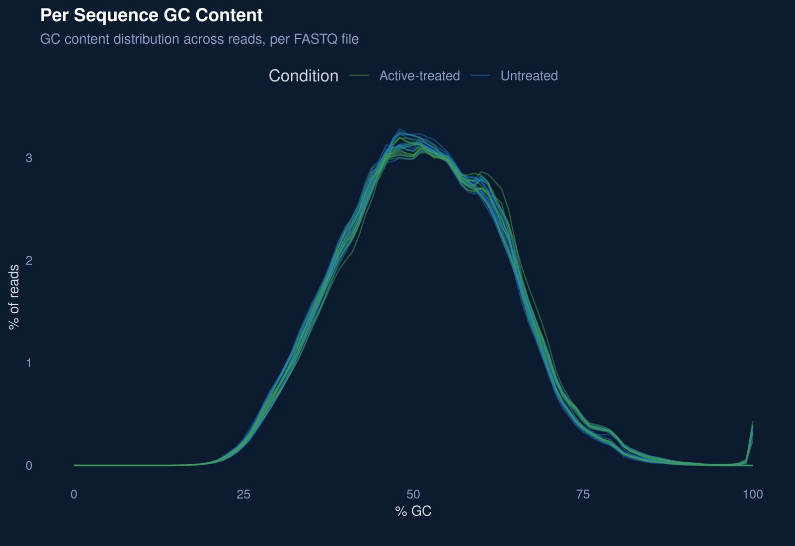
Per-sequence GC content distribution from FastQC
Figure 2. GC content distribution. Share of reads (y-axis) at each GC percentage (x-axis), one line per sequencing file. The files share a single, smooth peak and overlap across conditions. A second peak or a shifted curve would point to contamination or a library problem; neither is seen here.

02Analysis pipeline

A reproducible pipeline from alignment to functional interpretation, every tool and parameter version-controlled and documented for audit and reuse.

nf-core/rnaseq 3.14.0STAR 2.7.10a, two-passSalmon 1.10.0DESeq2 1.40.2 (VST) clusterProfiler 4.8.1GO and KEGG ORAGSEA, MSigDB Hallmark

03Principal component analysis

In this simulated example, PCA on VST-normalised counts places the treatment condition as the main source of variance, with the two groups separated before any statistical test is run. On real data, this is where a batch or donor effect would show up first.
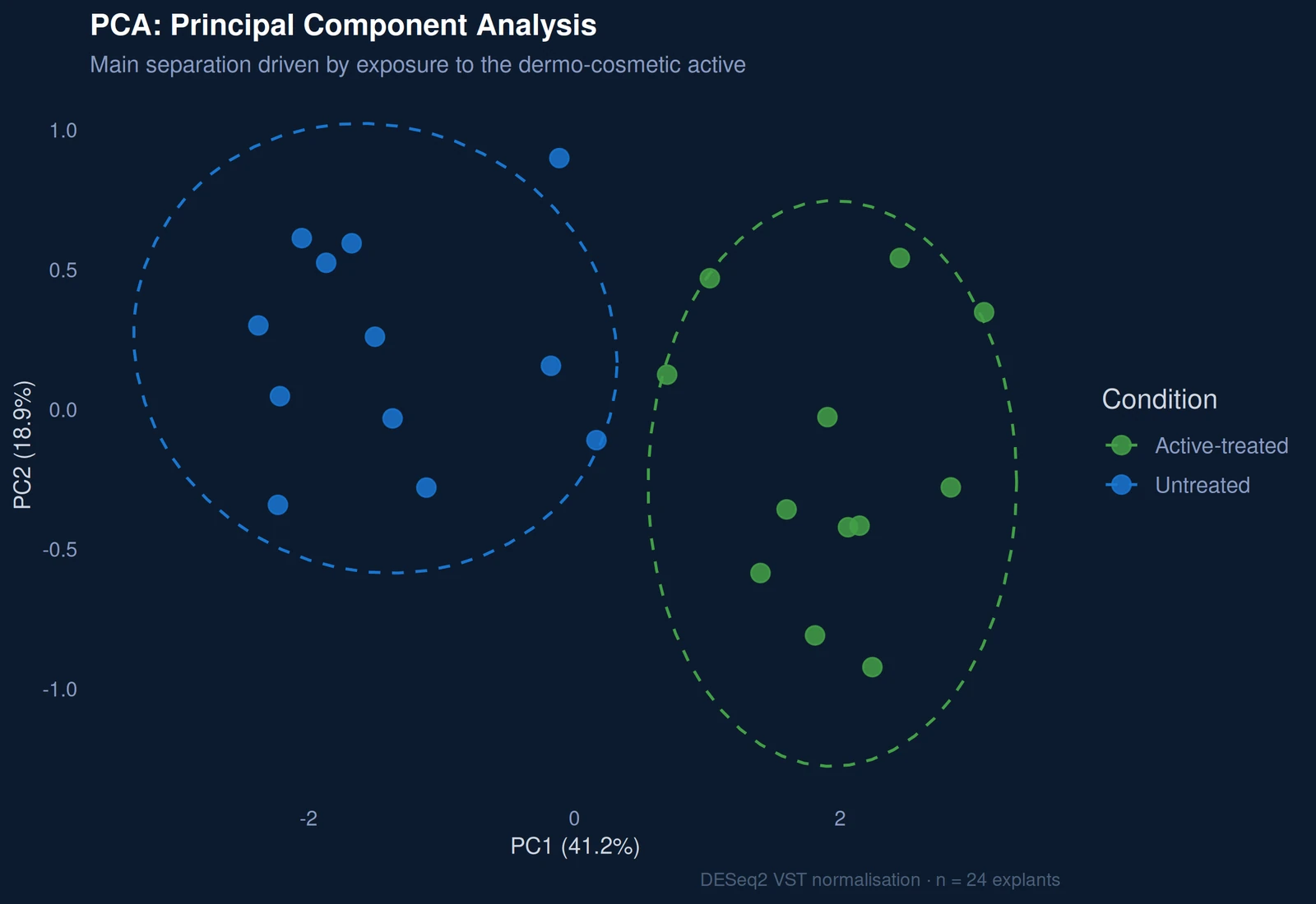
PCA plot of the simulated dataset, treated and untreated explants separated on PC1
Figure 3. Principal component analysis. Each point is one explant, placed according to its whole expression profile after normalisation (VST); points close together have similar profiles. The first component (PC1, 41.2% of the variance) separates treated from untreated explants; dashed ellipses outline each group. The treatment, not a technical factor, is the main source of variation. Simulated design of 24 explants, 12 per condition.

04Differential expression

The treated versus untreated comparison uses |log2FC| > 1.5 and padj < 0.05 (Benjamini-Hochberg). In the simulated data, matrix and re-epithelialisation genes are induced and inflammatory genes are reduced.
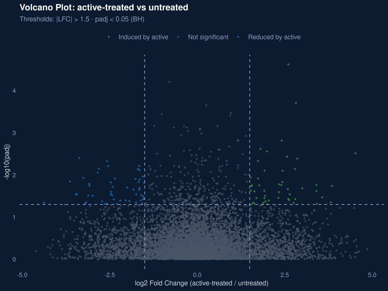
Volcano plot, active-treated versus untreated, simulated data
Figure 4. Differential expression. Each point is a gene. The x-axis gives the change in expression with the active (log2 fold change, right: higher, left: lower); the y-axis gives statistical confidence (higher is more significant). Dashed lines mark the thresholds |log2FC| > 1.5 and padj < 0.05. Green genes are induced by the active, blue genes are reduced, grey genes do not pass both thresholds. Simulated data.
↑ COL1A1, COL3A1, FN1, TGFB1, POSTN, VEGFA, HAS2, KRT16/17 ↓ IL6, CXCL8, CCL2, MMP9

05Expression heatmap

Clustering on a panel of 30 tissue-repair genes separates the two conditions. Collagen, growth-factor and re-epithelialisation genes are higher in the treated group; IL6, CXCL8, CCL2 and MMP9 are higher in the untreated group.
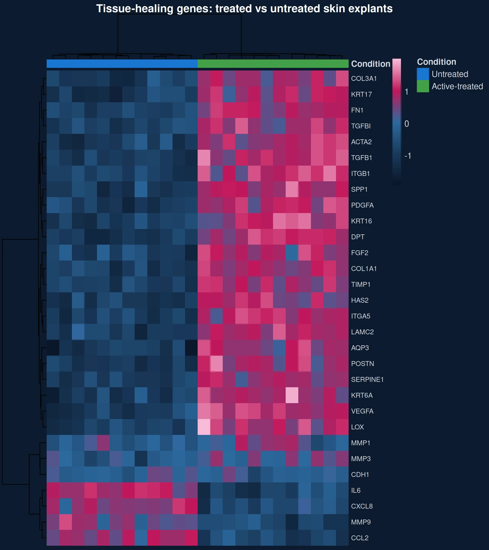
Heatmap of 30 tissue-repair genes across treated and untreated explants, simulated data
Figure 5. Expression heatmap of tissue-repair genes. Rows are 30 genes involved in tissue repair, columns are explants, with the condition shown in the top band. Colour gives relative expression (pink higher, blue lower). Clustering groups samples and genes with similar profiles: the two conditions separate cleanly, matrix and re-epithelialisation genes are higher with the active, and inflammatory genes (IL6, CXCL8, CCL2, MMP9) are higher without it. Simulated data.

06Functional enrichment

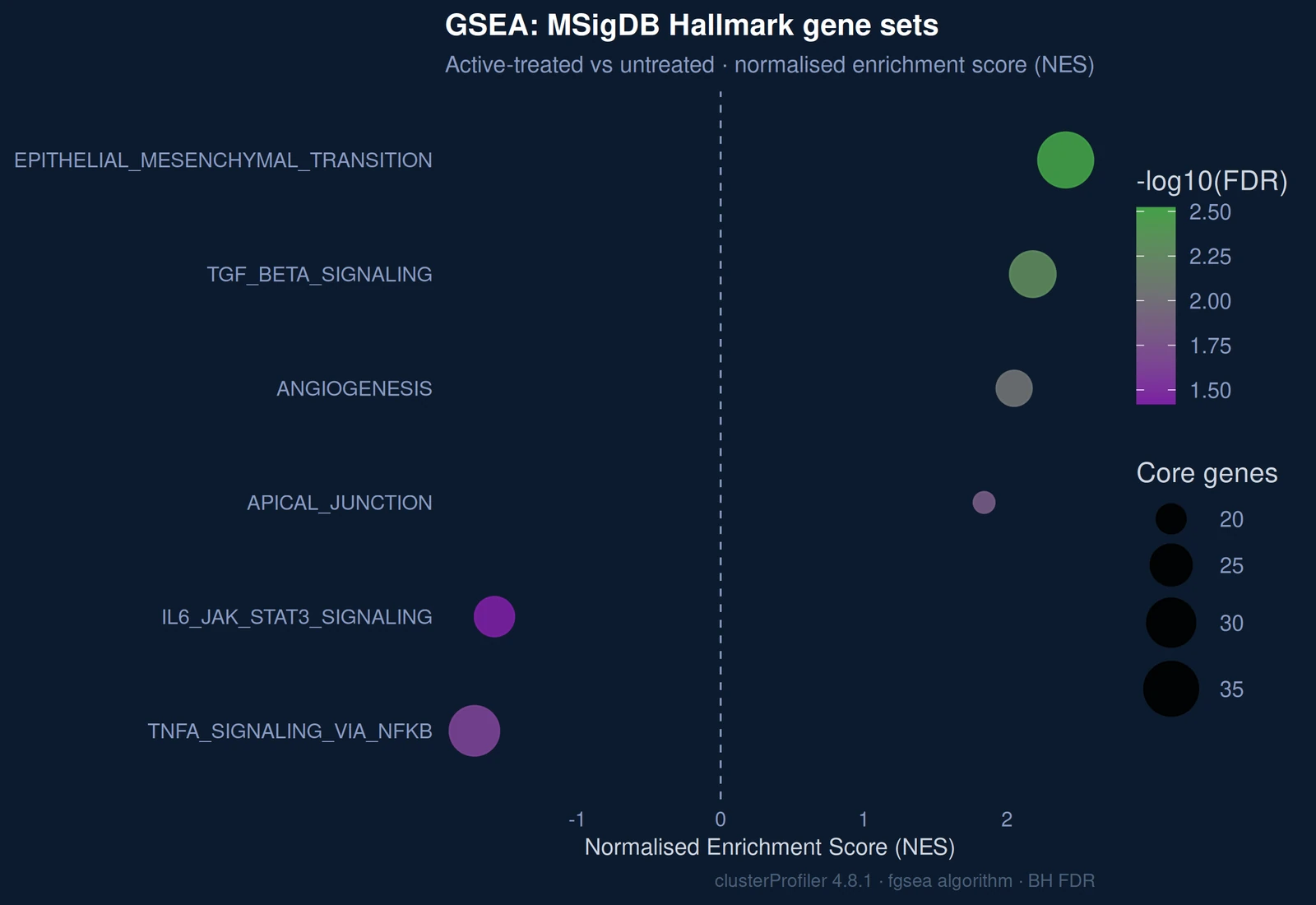
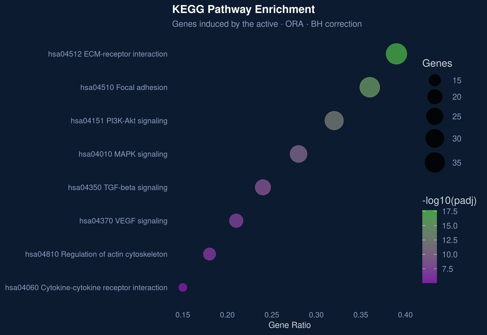
Genes induced by the active map onto extracellular matrix organisation, wound healing and keratinocyte migration. KEGG analysis converges on ECM-receptor interaction, focal adhesion and PI3K-Akt signalling. GSEA on the Hallmark gene sets places epithelial-mesenchymal transition and TGF-beta signalling at the top, with TNF-alpha/NF-kB and IL6/JAK/STAT3 signalling depleted.
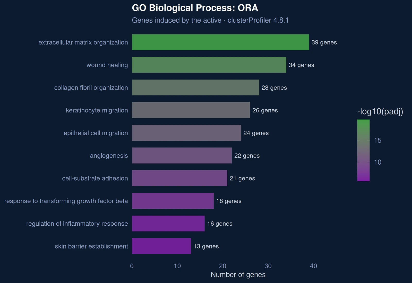
GO Biological Process over-representation analysis of induced genes
Figure 6. GO biological processes enriched among induced genes. Each bar is a biological process; its length gives the number of induced genes it contains, and its colour the statistical significance. The top processes, extracellular matrix organisation, wound healing and collagen fibril organisation, describe a coherent tissue-repair response. Simulated data.
KEGG pathway enrichment dotplot
Figure 7. KEGG pathways enriched among induced genes. Each point is a signalling or metabolic pathway. Its position gives the share of the pathway’s genes that are induced (gene ratio), its size the number of genes, its colour the significance after Benjamini-Hochberg correction. ECM-receptor interaction, focal adhesion and PI3K-Akt signalling lead, pointing to cell-matrix contacts and repair signalling. Simulated data.
GSEA on MSigDB Hallmark gene sets, normalised enrichment scores
Figure 8. GSEA on MSigDB Hallmark gene sets. Unlike the two previous analyses, GSEA uses every gene ranked by its change, not only those passing a threshold. Each point is a gene set: a positive score (right) means the set moves up with the active, a negative score (left) that it moves down; size gives the number of core genes, colour the FDR. Epithelial-mesenchymal transition and TGF-beta signalling go up; TNF-alpha/NF-kB and IL6/JAK/STAT3 inflammatory signalling go down. Simulated data.

07Methods & reproducibility

Every report documents alignment (STAR 2.7.10a, two-pass, GRCh38.p14 / GENCODE v43), quantification (Salmon 1.10.0), normalisation and differential expression (DESeq2 1.40.2), and functional enrichment (clusterProfiler 4.8.1, GO and KEGG over-representation, GSEA, Benjamini-Hochberg correction) with exact versions and thresholds, so that results can be audited or reproduced by your own team.

Want the full example report?

See the complete demonstration report, with its tables and gene lists.

Request the full example report